UI/UX, Brand Identity | Langara College - Project | Dezember 2019
TASK is responsive, so you can have all the information you need, wherever you are.
Problem & solution
In an era in which new technologies are continually emerging it's tough to keep updated on all information, trends and demands of the industry.
Task is the go-to web tool for staying up to date on the latest IT trends. It leads users by displaying the most popular development languages ranked by demand.
Users can also scan the ranking of job positions with the most openings.
Branding
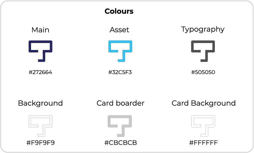
Colour
To create a trustworthy feeling for the brand, blue is used as the background colour.
White is often used to refer to technology, and also brings cleanliness and simplicity, embracing consistency with the choice of the web page layout.
Symbol
Task symbol is a condensed version of the original logo. The symbol must only be used if there is not enough area for the whole logo, or if the complete logo was used before on the same platform. The iconic T is also used as a favicon as well as the homepage button on the mobile version of the page.
Clearing Space
The clearing space for the logo and icon is one "module" indicated by the light blue square on the image. It corresponds to the weight of the typography.
The logo can't be used as a watermark on top of a busy background, background with not enough contrast, or text.
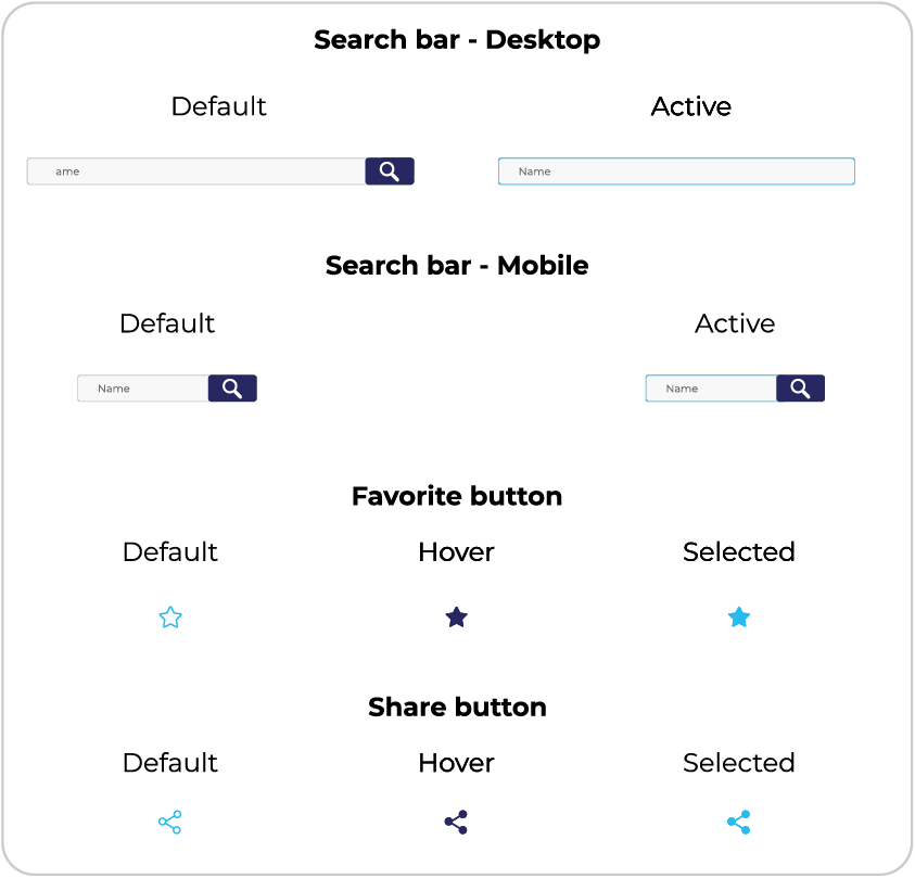
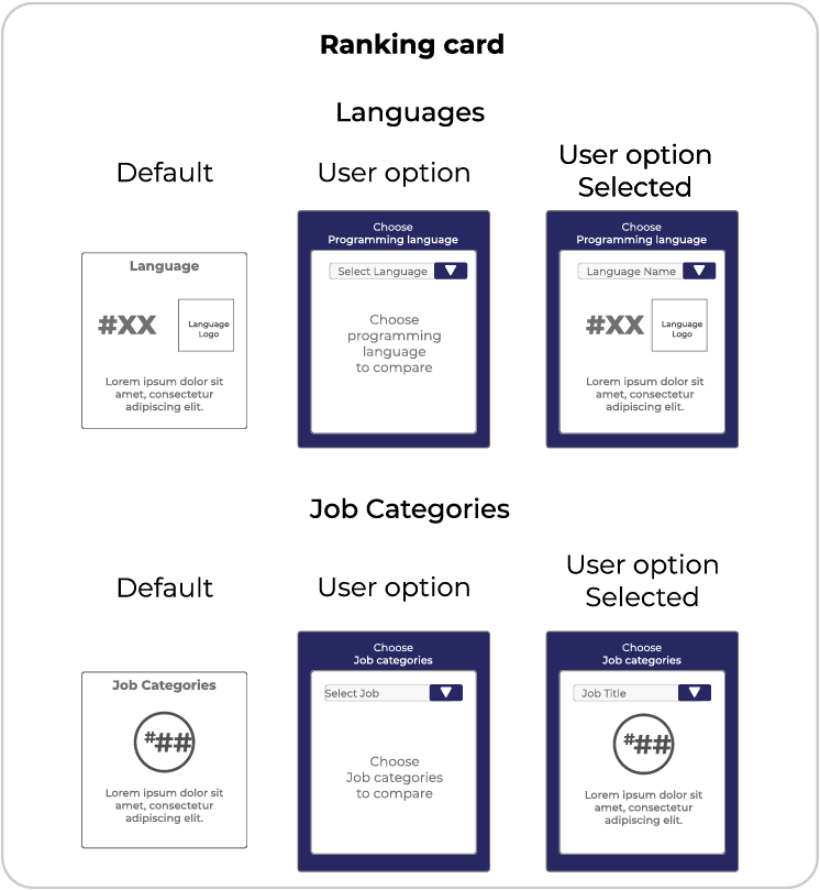
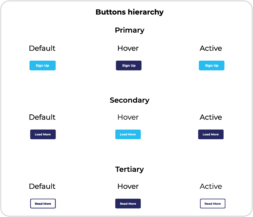
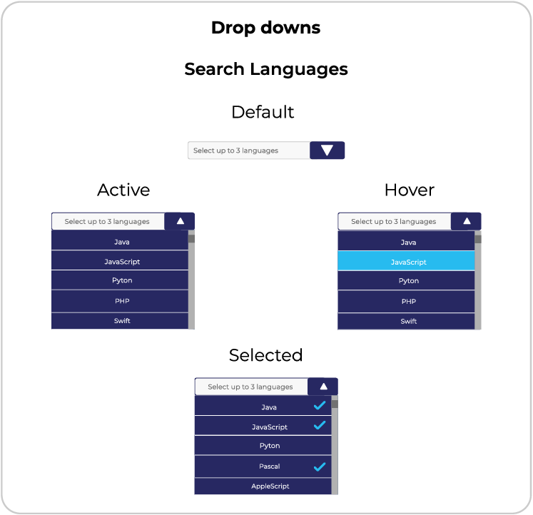
UiKit
Mockups
